App Icons
An app icon is the kind of thing where you only need one, but you can’t tell which one until you’ve seen thirty. So I don’t choose. I generate them all and then choose.
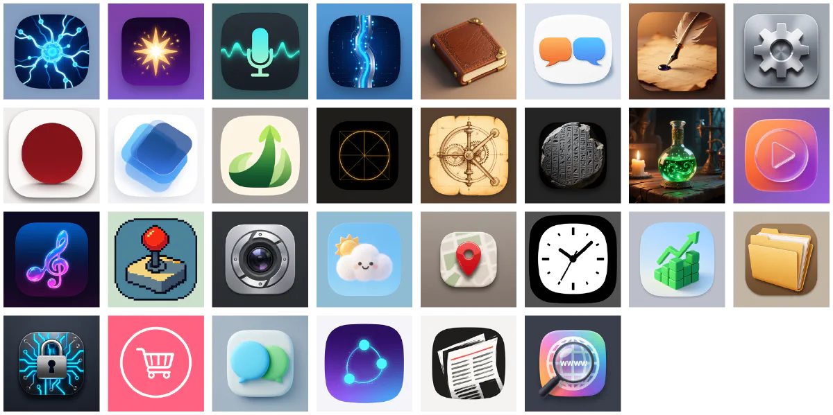
Why one concept needs three renders#
Because the first render is almost never the best one, and you can’t know that until you’ve seen the second and third.
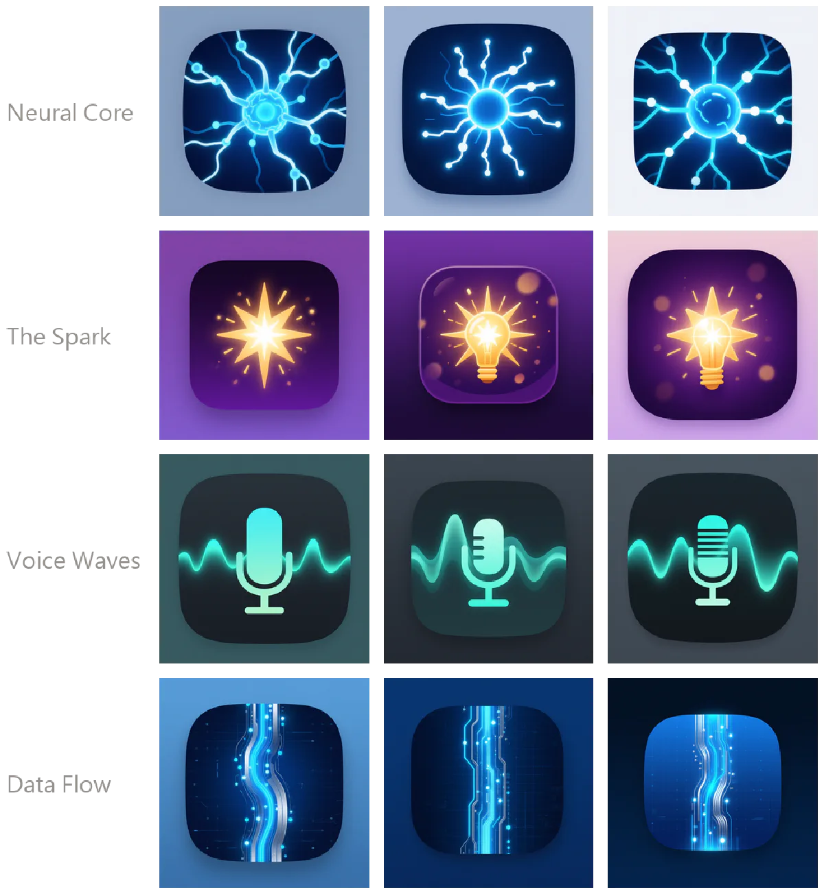
Look at row two, The Spark. Same sentence: the first seed gives an abstract starburst, the second and third add a light bulb on their own. That isn’t the model failing — the prompt genuinely admitted both readings. Generate only one, and you’ll believe your sentence had a single meaning, then ship an icon you don’t quite like.
Three is the sweet spot I settled on. Two collide too often. Five or more starts spending time on variants that barely differ.
Scale#
| Item | Count |
|---|---|
| Concepts | 30 |
| Proposals per concept | 3 seeds |
| Output | 90 renders |
| Size | 1024×1024 (App Store submission spec) |
| Environment | Local GPU, no cloud API |
Some of the method#
1. The concept list lives in code. Those 30 concepts are a Python config, not something I typed in each time. It sounds like overhead. It buys three things: re-runnability, the ability to regenerate just a few, and knowing three months later what was actually generated.
2. Render at 1024×1024 directly — never upscale. The App Store wants 1024×1024, so generate at that size. Images upscaled from 512 show it on the store listing, especially in gradients and glow edges.
3. No text in the icon. This is Apple’s guidance and also plain sense: the icon renders as small as 29pt on device, where any lettering is noise. Generative models love adding text to icons — frequently misspelled — so the prompt has to actively suppress it.
4. The rounded corner is the system’s job, not yours. iOS masks your square artwork into a rounded rectangle. Pre-round it yourself and you get a transparent halo after the system mask. All 90 renders above are full-bleed squares; the rounded shapes visible in Fig 2 are drawn inside the image as a design element, not cropped.
What’s not here#
- The full prompts for the 30 concepts, and the negative prompts that suppress text and pre-rounding
- When to use each seed strategy (random / derived from item name / fixed)
- What still separates this batch from shippable: contrast on dark backgrounds, legibility at small sizes, and family consistency with the developer’s other apps
Need a whole batch of visually consistent assets rather than one image? Commissions. Or see the art library — the same line scaled up 25×.