LINE Stickers
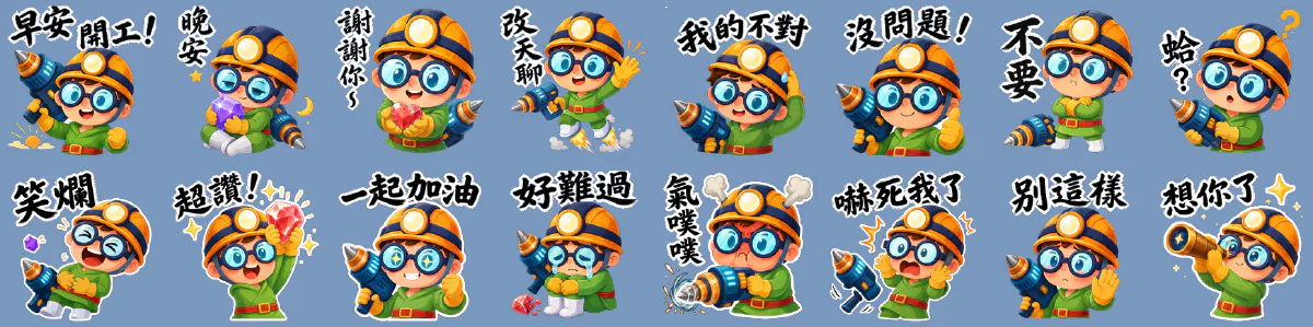
Of my nine apps, three have characters strong enough to carry a sticker pack: the cast from StoneStory, the eggshell chick from Kana Juku, and the miner kid from Gantt Planet. All three were made in one run — 72 stickers.
The Gantt Planet pack is live on the LINE Sticker Shop; the other two are finished to upload-ready state but not yet submitted. This page is about making them, not about how they sold.
StoneStory · 16#
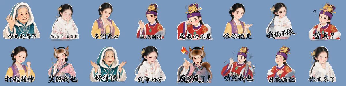
Almost none of this pack started from scratch, because every character in the art library already had eight expressions.
The sixteen stickers use only five characters (Grandmother Jia, Daiyu, Baochai, Baoyu, Xifeng), but each one picks one of those eight as its reference: 03 多謝費心 uses Baochai’s serious, 12 我命好苦 uses Daiyu’s crying, 13 反了反了 uses Xifeng’s angry. The file handed to the image model is byte-identical to the one in the library.
So what this pack actually cost was not “invent sixteen emotions” — it was adding gesture and sticker framing to emotions that already existed. The library having done eight expressions up front removed a whole round of work here. That’s where that decision pays itself back.
Kana Juku · 40#
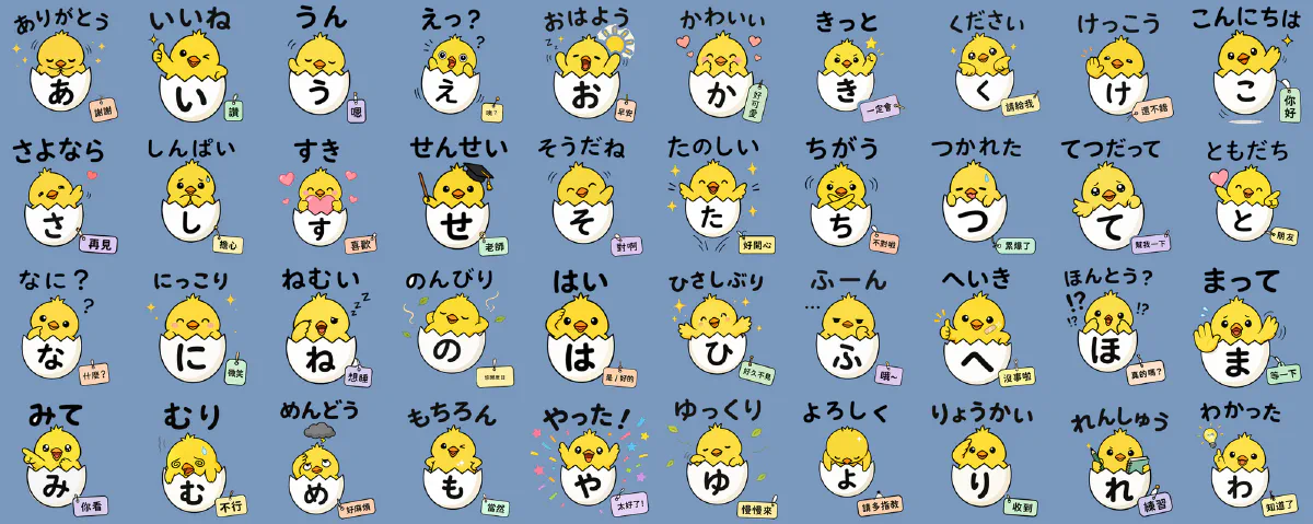
This pack has the most interesting constraint: it is a sticker pack and a study aid at the same time. Japanese-only loses buyers who can’t read it; Chinese-only loses the point. So all three layers have to work inside 370×320 — and when it shrinks down in a chat window, the thing that must still be legible is the kana on the shell.
That’s also why this pack hit every cutout problem there is. See below.
Gantt Planet · 16#
Some of the method#
1. One cutout algorithm will never cover a whole set#
This was the most expensive lesson of the three packs.
The intuitive approach is to pick a background-removal model and tune it until all forty come out clean. That road doesn’t end. All forty fail differently: the chick’s eye whites get eaten, the eggshell interior gets flood-filled away, the loops inside kana should sometimes stay white and sometimes not, and the little tag floating away from the body gets cut off entirely. Any global parameter set fixes one failure by causing another, and you go in circles.
The right approach is 80/20:
- Run one method across the whole batch to get 80% right
- Composite every result over a high-contrast colour (magenta or pure blue) and scan them
- Flag the specific ones that broke
- Fix each flagged one with whatever method suits it, hand-editing included
Out of forty, usually four or five are broken. Five minutes of hand-patching on those beats an hour hunting for perfect parameters — and the hour usually introduces new regressions anyway.
Each method has its own temperament:
| Method | Good at | Where it breaks |
|---|---|---|
| General matting model (u2net) | Holds shape when the subject is contiguous | Eats small elements detached from the body (that tag) |
| Sharp-edge model (isnet) | Clean edges | Eats the white interior of closed shapes (the eggshell) |
| Anime-specific model | — | Far too aggressive on this style, often eats the body. Avoid |
| Colour-key flood fill from the edges | Preserves enclosed white (shell, kana loops) | One gap connecting subject to background and it eats straight through |
| Region split | Top half one method, bottom half another | Only worth it when the requirements genuinely conflict |
| Redraw in code | Typos, tags | Five lines of Python — don’t regenerate the image for this |
Kana Juku ended up on region split: the big kana on the shell must keep its white, while the kana loops in the phrase above must be punched transparent — the same shape with two opposite requirements, which can only be handled by splitting the image.
2. Keep or strip the halo — the background decides, not you#
Generated captions usually come with a white outline. It looks clunky on your monitor. In a chat window it is load-bearing:
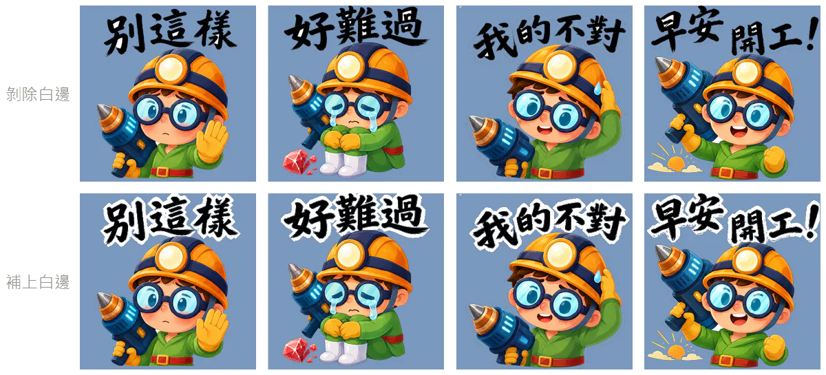
So review has to happen on a coloured background. Looking at thumbnails in a file browser, a halo problem will never surface. LINE’s backend has a “change background colour to check cutout” dropdown for exactly this; if you don’t want to wait for an upload, five lines of Python compositing onto magenta does the same job.
One detail matters when restoring a halo: only fill pixels that are currently transparent. The character’s glasses frame and the drill’s outlines are black lines too — without that condition they get haloed as well and the whole sticker is ruined. Also erode the seed mask by one pass first: brush strokes are 8–15 px thick and survive it, 2 px outlines don’t and drop out of the seed automatically.
3. Make five first#
Generating all forty and only then discovering the style is wrong, the background didn’t come off, or the Chinese characters are wrong — that’s the expensive failure, and it’s entirely avoidable.
The rule: produce the main image, the tab icon, and four or five stickers, run them through the full post-process, upload and inspect them on coloured backgrounds, and only then generate the remaining thirty-five. Ten minutes up front saves one to two hours of firefighting.
4. The first version is the one you throw away#
StoneStory didn’t start out like this. Version one composited the library’s portraits with outlined captions locally, in code — no image model involved at all:
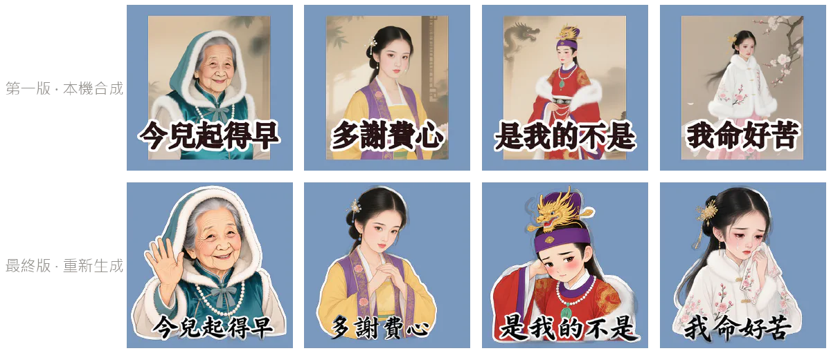
Was version one usable? Yes, and far cheaper — the art was already there, it only needed type. But it reads instantly as a picture with text on it rather than a sticker, and the difference is pose.
That is precisely the other side of the library’s trade-off. To hold eight expressions consistent, the portraits froze the pose and put all the emotion in the face. Inside the app that’s the right call — the reader is looking at the face beside a line of dialogue. A sticker isn’t the same: half of a sticker’s emotion lives in the hands. So the final version had to send those portraits back through an image model to buy gesture, paying for it with consistency that fell from structurally guaranteed back to close enough.
Same source art, two uses, opposite optima.
Keeping version one is useful. It’s the evidence for why that extra step was worth taking.
What’s not here#
- The colour-key tolerance, and how to auto-detect it when the background flips from grey-white checker to solid black midway through one batch (a nasty one)
- Why the background test can’t be a combined “very bright or very dark” predicate (the flood eats through the background into the black brush lettering)
- How erosion passes and dilation radius are paired when restoring a halo
- The 16-phrase SNS coverage table — which situations a pack has to cover before it’s usable
- How generation prompts are derived from character reference art, and how to stop the model inventing Chinese characters
The cutout and batch handling here share their lineage with the 2,545 pieces in the art library. Got a batch of images needing the same treatment several hundred times? Commissions.